MODES UI Design System
Contributed to a design system spanning 3 company identities through a major merger. 95 components, 71 releases, adopted across 26+ internal products.

MODES UI is the design system I worked on for five years at Metso. It serves 340 designers building 26+ products across React, Vue, and Angular. During my time there the company went through a major merger and two rebrands, and the system had to survive all of it without being rebuilt from scratch.
95 components, 71 releases, 4 complete themes. The work was less about designing individual parts and more about building abstractions resilient enough to outlast the company that commissioned them.
The Challenge
Metso's product portfolio is vast and fragmented. 26+ digital products, three engineering frameworks, six distinct software packages, and a design team that grew from 2 to 12 during our engagement.
The harder problem was organisational. A design system doesn't ship itself. It needs buy-in from every product owner, every engineering lead, every stakeholder who has been doing things their own way for years. We started from a position of active skepticism. Our first job was making the value undeniable.
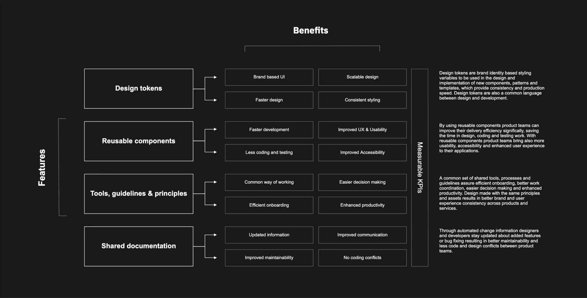
Information Architecture
Before designing a single component, we mapped the system's value architecture: the four pillars that would justify every decision made inside it: design tokens for brand consistency and speed, reusable components to reduce development cost, shared tools and principles for alignment across teams, and living documentation to eliminate the constant drift between design and engineering.
This IA shaped how we sold the system internally, how we prioritised what to build first, and how we measured whether it was working.
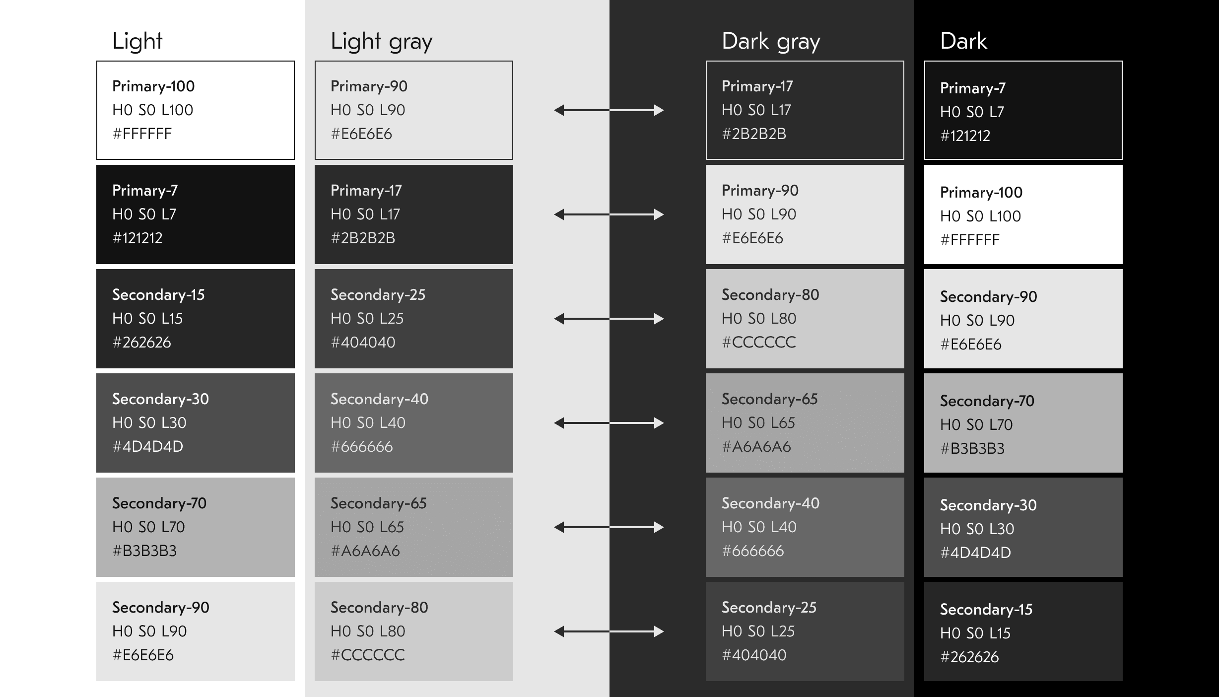
Token System & Themes
The token layer was the foundation everything else stood on. Rather than hardcoding values into components, we built a semantic token system: colour, typography, spacing, and iconography as variables that could be swapped per theme without touching component logic.
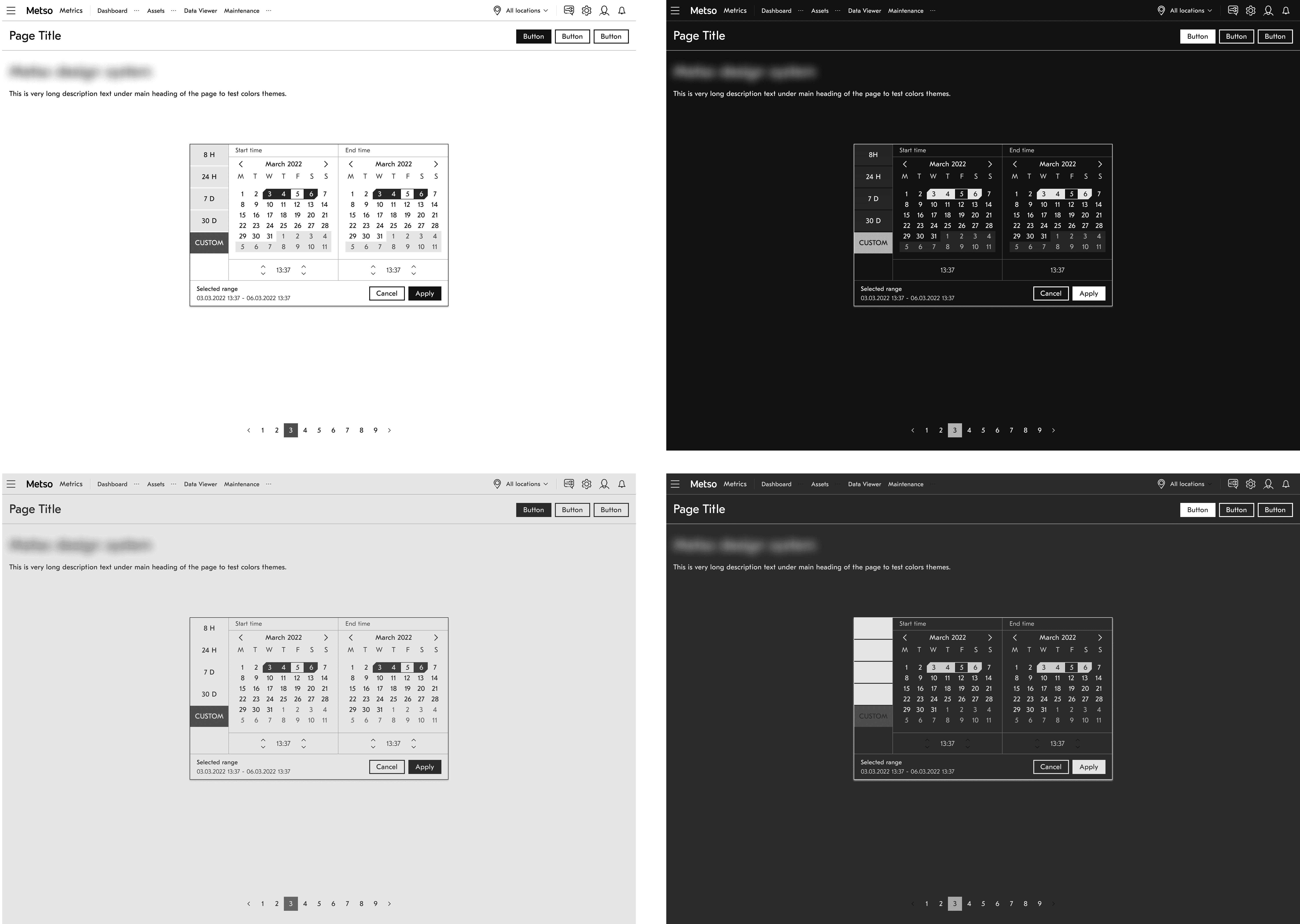
We shipped four complete themes: Light, Light Gray, Dark Gray, and Dark. This wasn't cosmetic. Industrial software runs in environments from bright office screens to dimly-lit control rooms. Every theme had to pass AA accessibility contrast ratios at every level.
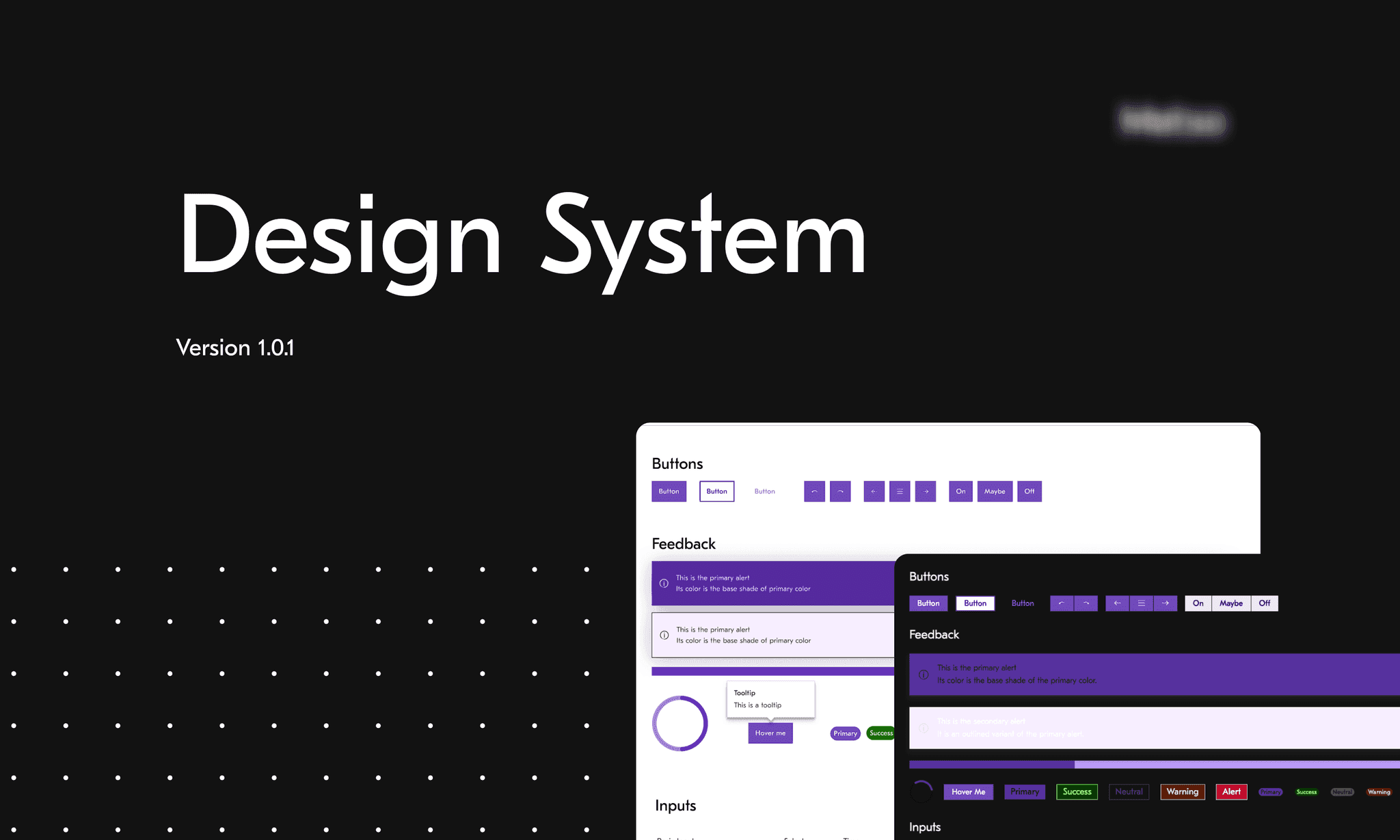
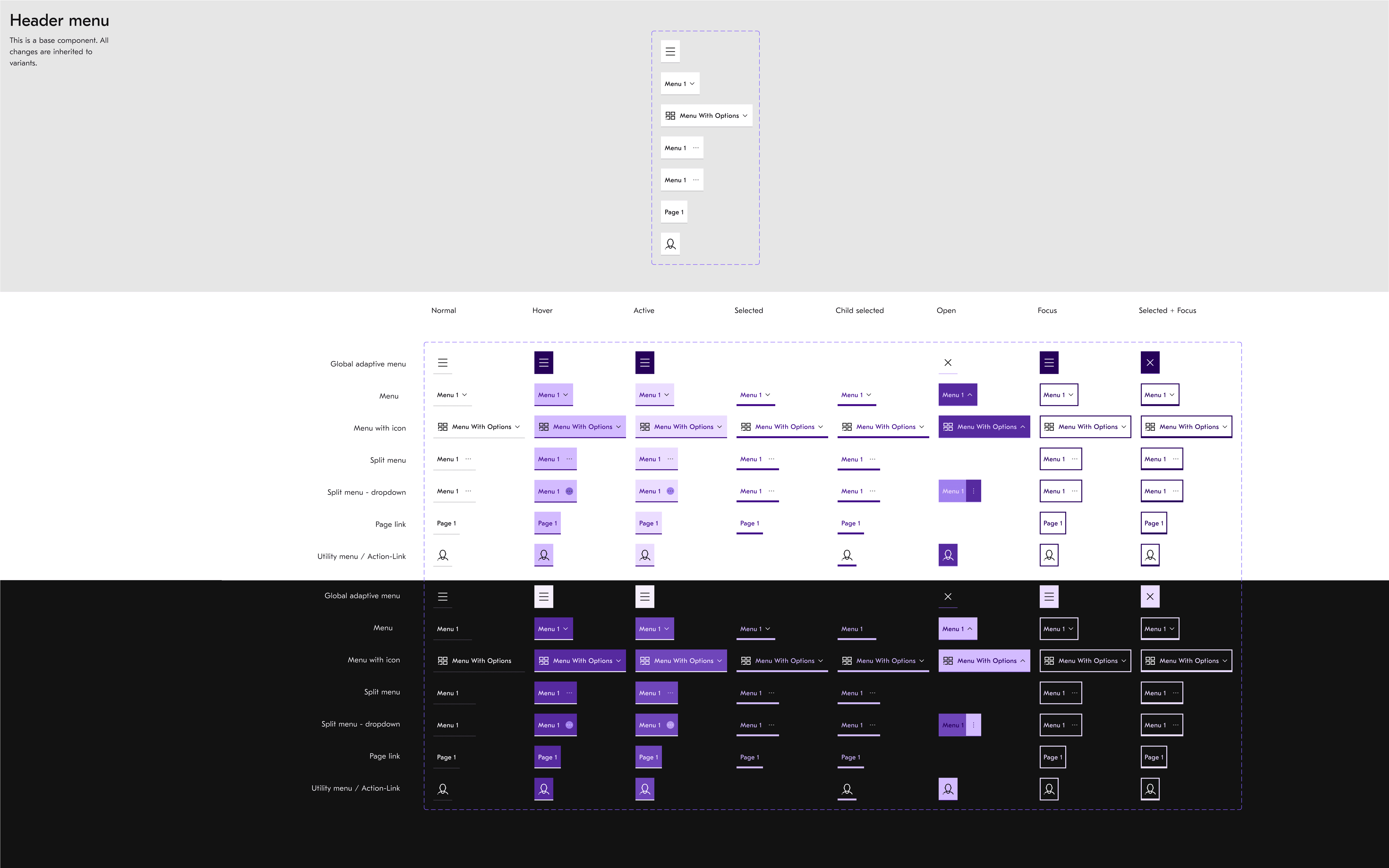
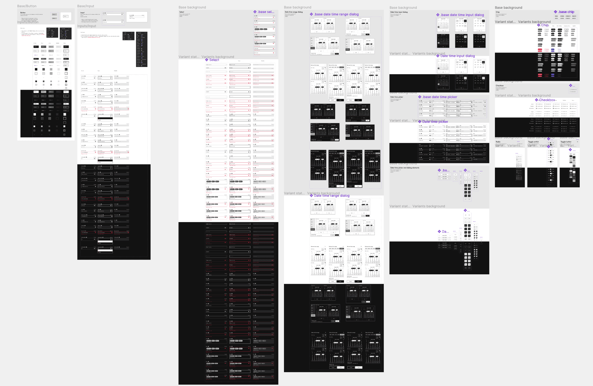
Component Library
~95 components, each required to meet a non-negotiable checklist before release: AA accessibility in both colour and text contrast, full dark and light theme support, responsive behaviour across breakpoints, all interaction states (disabled, error, hover, focus), and keyboard navigation.
The header navigation alone, one of the most complex components, required documenting dozens of states across both themes. Component specs were built to be consumed directly by engineering, closing the handoff gap that had been creating divergence across the six product packages.
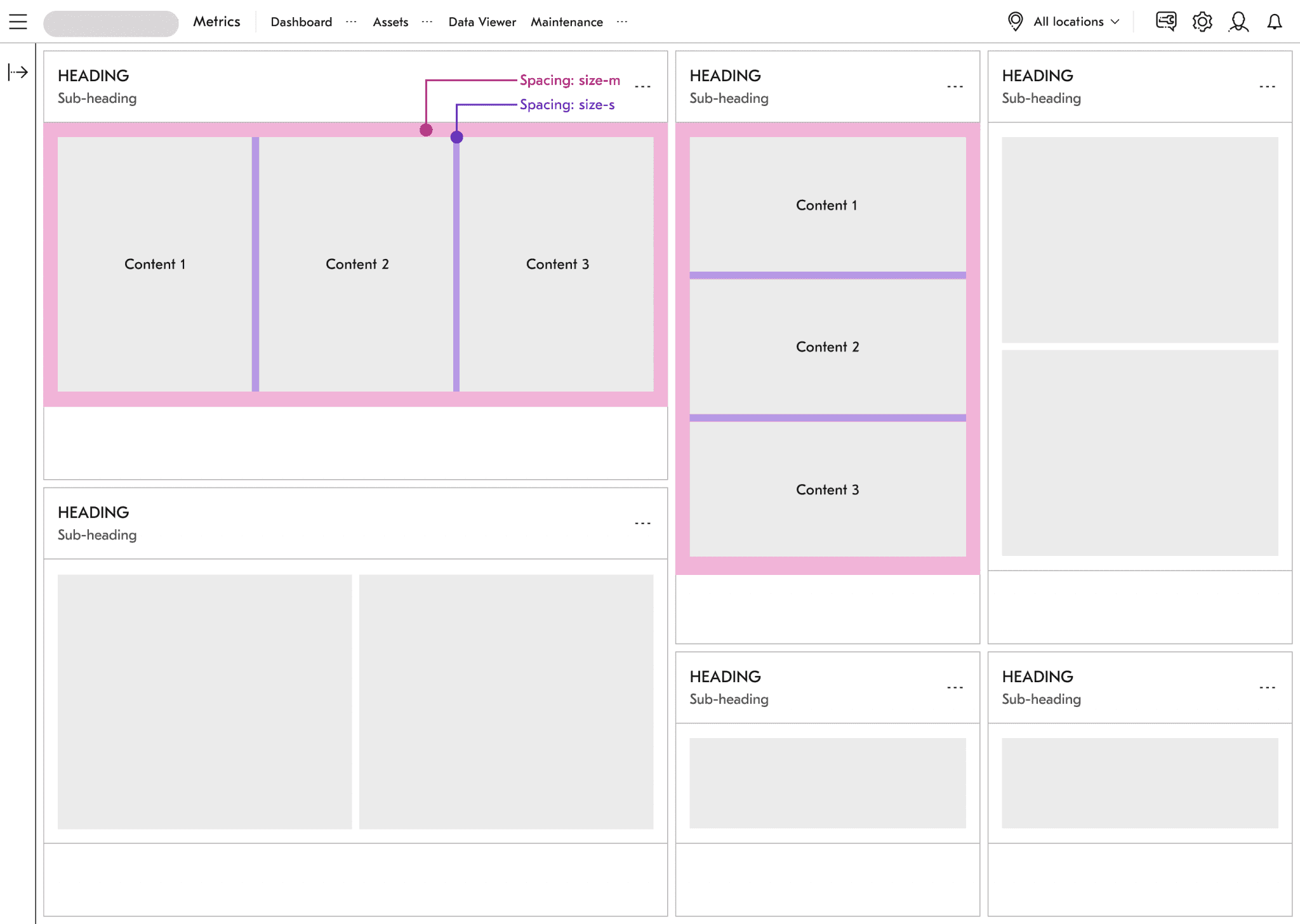
Templates
Components alone don't make consistency. Teams also need guidance on how to assemble them. We created a template library for the known patterns in industrial software: multi-panel dashboards, data tables with filtering, asset detail views, maintenance workflows.
Templates gave product teams a starting point that was already aligned with the system, dramatically reducing the time to first meaningful screen.
The Result
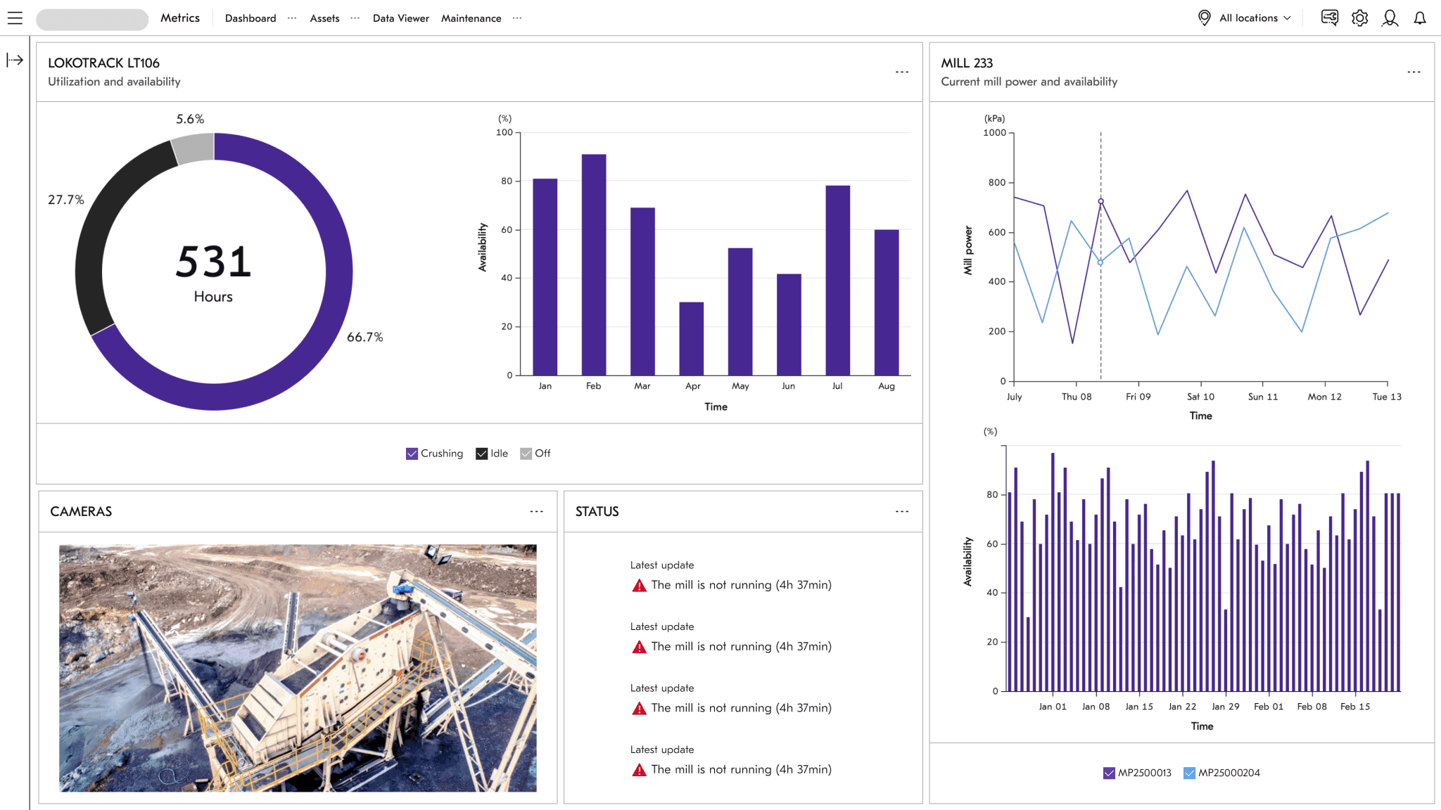
Here's a real-time mining equipment dashboard: donut charts tracking machine hours, live bar charts for availability, camera feeds, status panels. This runs on a crushing site.
A separate product team built this screen using the same components, and it looks like it belongs to the same family as every other Metso product. That was the whole point.
Adoption Signal & Program Context
26+ products
Adoption signal
71 public releases
Adoption signal
~95 components
Design contribution
React · Vue · Angular
Implementation context
340 community members
Program context
4 themes
Environmental range
5 years
Program tenure
Most design systems don't survive a rebrand, let alone a merger. This one did. That's not luck, it's what happens when you build the abstractions at the right level.